Spring 2026 Color Forecast for Wall Art: Blush, Sage & Sky
Spring palettes often move toward lighter tones, and wall art is one of the fastest ways to bring that shift onto your walls. In 2025, three shades pair especially well: blush (a gentle pink), sage (a muted green), and sky (an airy blue). Together, they create a soft, modern decor look that still feels clear and intentional.
This guide explains how each color behaves in a canvas print or art print, how to combine the trio without a cluttered look, and how to choose the right format and size before you buy.
Why blush, sage, and sky work together
These tones form a “soft contrast” palette: each one reads clearly, but none of them overpowers the others. That balance makes them easy to use in wall decor—either as a single hero piece that carries two of the shades, or as a coordinated set where each piece leads with one color.
They also match well with common neutrals. Off-white, warm beige, light gray, and natural wood tones all sit comfortably beside blush, sage, and sky. If you like a sharper look, adding one dark anchor (black or deep brown) can keep the palette crisp.
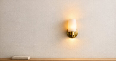
Blush wall art
What blush looks like in print
The best blush in wall art reads warm and clean. It is not neon, and it is not muddy. In a canvas print, blush often looks strongest when it appears in wider shapes or gentle gradients. In an art print, blush can also work as a calm background behind line work or a simple subject.
Styles that suit blush
Blush works well with abstract shapes, minimal line drawings, and soft floral themes. If you want blush with a more graphic feel, look for designs that pair it with off-white and charcoal so the pink stays grown-up. For a curated mix of styles that can carry blush tones well, browse Abstract Wall Art Prints.
Quick pairing rules for blush
- Choose one steady neutral: off-white, warm beige, or light gray keeps blush clean.
- Add one dark anchor: black or deep brown gives structure to a soft palette.
- Keep patterns controlled: if the print is busy, keep the surrounding styling simple.
Sage wall art
What sage looks like in canvas art
Sage is a muted green that feels natural and current. In canvas art, sage often reads as a middle tone that helps other colors look balanced. It also sits nicely beside warm neutrals and pale stone-like finishes, making it easy to match with many existing items.
Styles that suit sage
Sage pairs naturally with botanical themes and organic shapes, but it also works with modern patterns and quiet abstract designs. If you want sage with leaf-led styling, start with the Floral Botanical Wall Art Collection. If you want a broader range of green-leaning pieces, the Nature Wall Art Collection is a good starting point for sage-led pieces with gentle, natural tones.
Pairing rules for sage
To keep sage looking modern, repeat your neutral tones and avoid mixing too many greens at once. If you want a crisp look, pair sage with soft gray and white. If you want a warmer look, pair sage with cream and light wood.
Sky wall art
What sky looks like in a wall print
Sky is an airy blue that reads open and light. In wall art, sky can show up as a large color field, a gentle gradient, or a background tone behind a subject. Even small notes of sky can brighten a print when paired with off-white and soft gray.
Styles that suit sky
Sky tones work especially well with open scenes, horizon-led compositions, and clean designs that leave plenty of blank space. If you want pieces built around light blues and open views, explore the Skyscape Wall Art Collection. For an even cleaner approach, simple designs can give sky a gallery-like finish—see the Minimalist Art Collection for clean lines and controlled color.
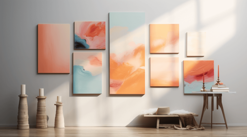
How to combine blush + sage + sky as a set
The easiest way to combine the trio is to decide which tone leads, then let the other two play supporting roles. When every piece carries equal color weight, the set can feel busy.
Three layout formulas that work
- One lead, two accents: one main piece with a clear lead color, plus two smaller pieces where the other colors show up in smaller areas.
- One tone per piece: a three-piece set where each print leads with one tone, tied together with the same neutral background.
- Two-and-one: two pieces that share the same base neutrals, plus one “pop” piece that introduces the third color in a controlled way.
Do / do not checklist
- Do: repeat the same neutral (off-white, cream, or gray) across all pieces.
- Do: keep spacing between pieces consistent so the group reads as one unit.
- Do not: mix three high-detail patterns on one wall—keep at least one piece calm.
- Do not: push all three colors to full strength in every print.
Choosing format and size
Canvas print vs art print
A canvas print often softens color transitions and gives blush, sage, and sky a painted feel. An art print can look sharper, which can be helpful for line work and geometric designs. If your goal is a softer, layered look, canvas art is a strong choice. If you want crisp edges and fine detail, an art print may fit better.
One large piece vs a set
If you want a fast update, choose one large wall art piece that carries two of the three colors, then let the third color show up as a small note in the print or frame. If you want a planned look, a two- or three-piece set makes the palette feel intentional from the start.
Sizing checklist before you buy
- Measure the wall area you want to fill, then choose art that covers about two-thirds of that width.
- If you are placing art above furniture, keep the art narrower than the furniture width.
- For sets, keep the gap between pieces consistent across the row or grid.
FAQs
1) Is this palette better as one large canvas print or a set?
One large piece is the simplest choice. A set works best when you want clear balance between the three tones.
2) Which neutrals work best with blush, sage, and sky?
Off-white, cream, light gray, and light tan are reliable. Pick one neutral and repeat it across your pieces.
3) Can I mix abstract and botanical styles in one group?
Yes. Keep the palette tight and share at least one neutral background tone across the group.
4) How do I keep blush from looking too sweet?
Use blush with clean shapes and add one dark anchor tone in the print or frame.
5) How do I keep sage from feeling heavy?
Pair sage with white or soft gray, and choose designs with open space rather than dense pattern.
6) How do I keep sky from feeling cold?
Choose sky pieces that include warm neutrals, or add a small blush note in the print.
7) Should all frames match?
Matching frames create a planned look. If you mix frames, keep them within the same finish family.
8) How many colors should be in one print?
A safe rule is one lead tone, one neutral, and one small accent tone.
9) What print styles suit soft colors best?
Gradients, broad shapes, simple line work, and calm fields of color usually work well.
10) What if my wall already has strong color nearby?
Pick the tone that matches that color best, then keep the other two shades subtle in the art.
11) Does lighting change how these colors look?
Yes. Soft colors can shift through the day. If possible, view your wall area in both day and evening light.
12) How do I choose between two sizes?
If your wall area is wide, the larger option usually looks more balanced. Small art can look lost on a large wall.
13) Is this palette a good gift idea?
Yes. These tones blend easily with common neutrals, so they are a safer choice when you do not know every detail of someone’s style.
14) What is the fastest way to build a cohesive set?
Start with one style family (abstract, botanical, or open-scene prints), then pick pieces that repeat the same neutral and one shared tone.
15) What if the delivered color looks slightly different than on-screen?
Screen settings vary. Also, wall color and lighting can shift how a print reads. Try viewing it from different angles and times of day.
Wrap-up
Blush, sage, and sky can bring a spring-ready look to your wall decor without major changes. Choose a lead tone, keep neutrals consistent, and pick a format that suits your preferred look. With those basics in place, your canvas print or art print will feel fresh and modern well past the season.